[Client]
Sun Life
[Industry]
Insurance
Finance
[Project goals]
Integrate multiple agent applications and improve usability and to drive user adoption to reach 90%.
Advance the visual design to complaint with the latest brand guideline, Helios.
[My scope of work]
As-is user journey mapping
Sort out existing flows of major post-purchase tasks. Identify pain points and areas of improvement.
Redesign users flows of key features
Advance the users experience of leads gen, client documents download, investment-linked fund price, promotion and announcements.
Wire-framing & prototyping
Visualise user flows to validate the design with stakeholders and align with cross-functional teams.
① Background
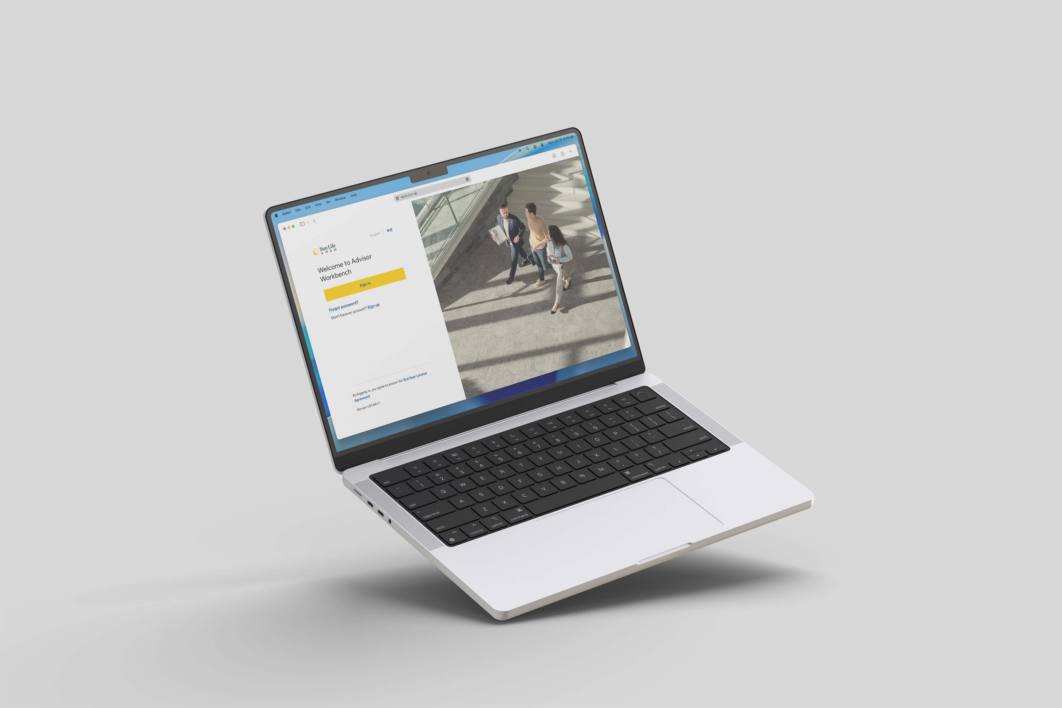
As one of the dominant players in insurance market, Sun Life needed to upgrade its advisor tool to maintain its leading position in digital era.
While Sun Life’s existing advisor platform has helped advisors to expand their business for years, it was falling behind. The tool has been outdated compared to the superior solutions released by their major rivals — solutions that are increasingly preferred by brokers and banca partners.

To boost advisor productivity and improve client service, the company decided to revamp the tool to enable advisors manage client profiles, process new business, and perform other critical tasks through a centralised hub.
② Approach
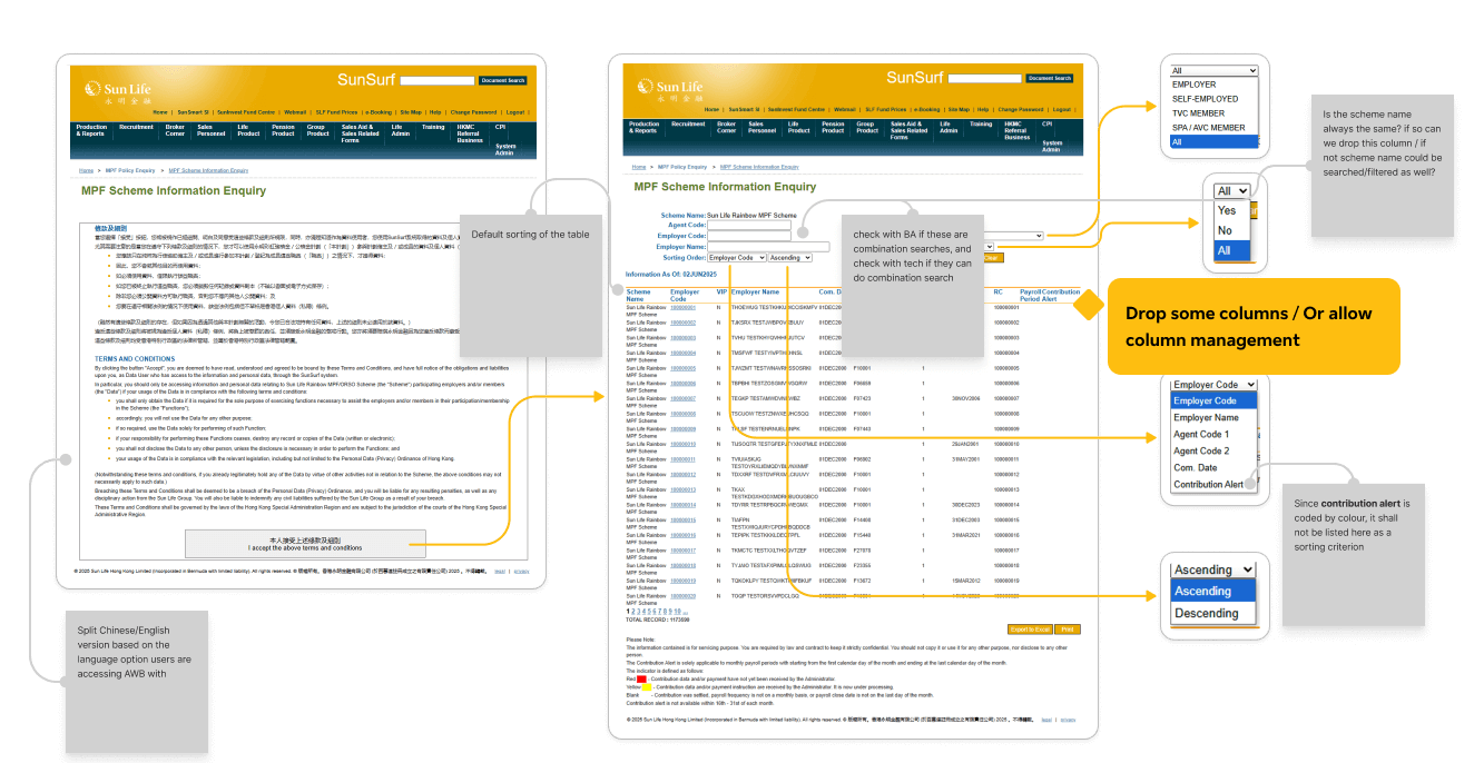
[As-is feature auditing] Before designing each feature, I conducted a thorough audit of the existing user flows to diagnose potential risks and gaps for improvement.

This ensured that the new design would be capable to achieve functional parity while delivering a significantly more intuitive and efficient user journey.
[Rapid prototyping] This project operated under significant constraints, including a fixed, aggressive timeline and limited backend resources. To ensure success, I conducted rapid prototyping to facilitate at least 2 stakeholder review cycles per sprint.

This iterative process was critical for validating the business requirements and user needs, as well as confirming technical feasibility for design implementation.
③ Final design
[Client documents download] “As a broker firm admin / a banca super user, I want to be able to check the corporate clients and download related documents.”
Although document download do not sounds like the most exciting feature on the planet, it could be challenging to consider all edge cases that users might encounter in the process. Imagine when a user tries to download an extremely large file, but their session times out after 15 minutes of inactivity, how could we avoid or handle their frustration?
Although document download do not sounds like the most exciting feature on the planet, it could be challenging to consider all edge cases that users might encounter in the process. Imagine when a user tries to download an extremely large file, but their session times out after 15 minutes of inactivity, how could we avoid or handle their frustration?
[Leads generation] “As an Sun Life agent, I want to view the details of potential clients assigned to me and follow up the sales status.”
In the real world, converting a lead into a sale is rarely a straight line. The as-is design, however, forced a rigidly linear process, requiring users to mark milestones sequencially. This mismatch with the natural made the feature feel out of touch, ultimately leading to low adoption.
The new design introduces a more flexible way to track progress with leads. Without needing to alter the backend data structure, I reimagined the milestones as a checklist, rather than a rigid progress bar. I also decoupled the close status from the client engagement status. This means users are free to skip steps and update information in any order they see fit, mirroring the non-linear nature of their actual workflow.
④ Impact & Reflects
In its first two months, the new advisor platform was embraced by over 95% of users, demonstrating its immediate value and relevance.
What we did good?
The design team demonstrated remarkable ownership, with each designer proactively clarifying and driving their features. This initiative was key to our ability to deliver high-quality work at speed.
What we could have done better?
The accelerated timeline meant we were unable to conduct a proper discovery phase before the project kicked off. In hindsight, dedicating time to explore user needs and feature capabilities upfront would have been invaluable.